

Blog
In Which We Take a Stand
A collection of viewpoints, articles and opinions on user experience, technology, AI, and leadership in ever-evolving, high stakes industries.

The Epic Tale of Making Better Chart Legends
Some of the most impactful design work we do is in decidedly un-glamorous areas: MFA screens, notification preferences and the like. Recently, Product Design Lead Tony Leo and I set out to conquer a fearsome beast: chart legends. We undertook this quest on behalf of our data visualization product Rover, and the clients who use it.
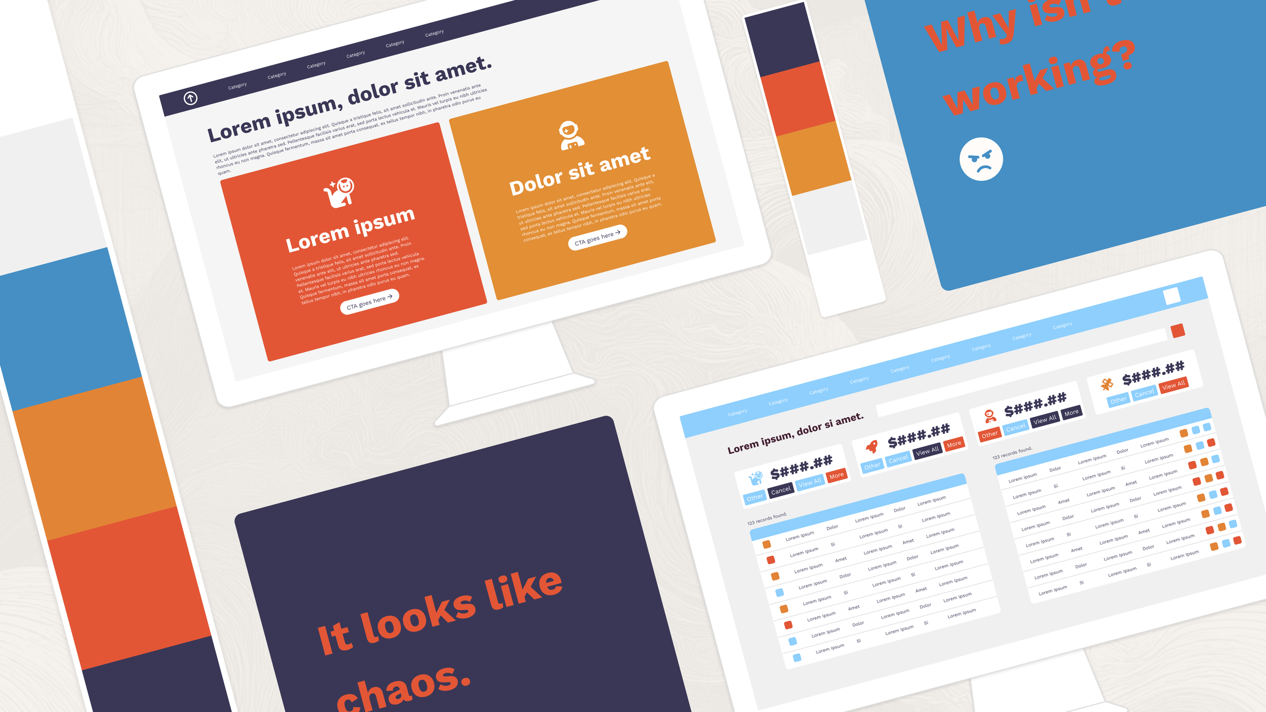
Why Great Colors Can Still Make Ugly Software
Having well-crafted brand standards helps get you closer to the ballpark of something that works, but there are still all sorts of pitfalls. I’ll list a few common ones here but there are probably dozens of ways this can go wrong. If you’re struggling, feel free to get in touch with us for help.
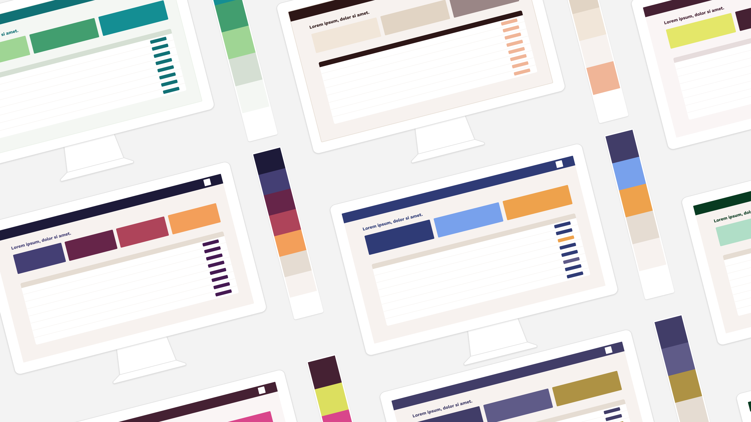
Why is color so hard to agree on?
Nothing generates passionate opinions quite like color. Over the years, I’ve heard more emotionally charged feedback on color than probably any other single aspect.

Four Patterns I've Noticed Across Hundreds of Launches
I’m going to cover four experience-based generalizations this week (meaning these are things I feel in my bones vs. have been surprised by data on) and then we’ll see how those compare to the data-driven conclusions after we finish a report we’re working on aggregating data across hundreds of launches.
Start building.
The first step to work with us is an initial meeting. You can schedule that using the button below.