
Why is color so hard to agree on?
Nothing generates passionate opinions quite like color. Over the years, I’ve heard more emotionally charged feedback on color than probably any other single aspect.
And yet, many consultants dismiss color as something that should be viewed purely through a functional lens, saying that aesthetic preferences are too varied to matter. That’s a convenient excuse to avoid a challenging, but not impossible, design problem.
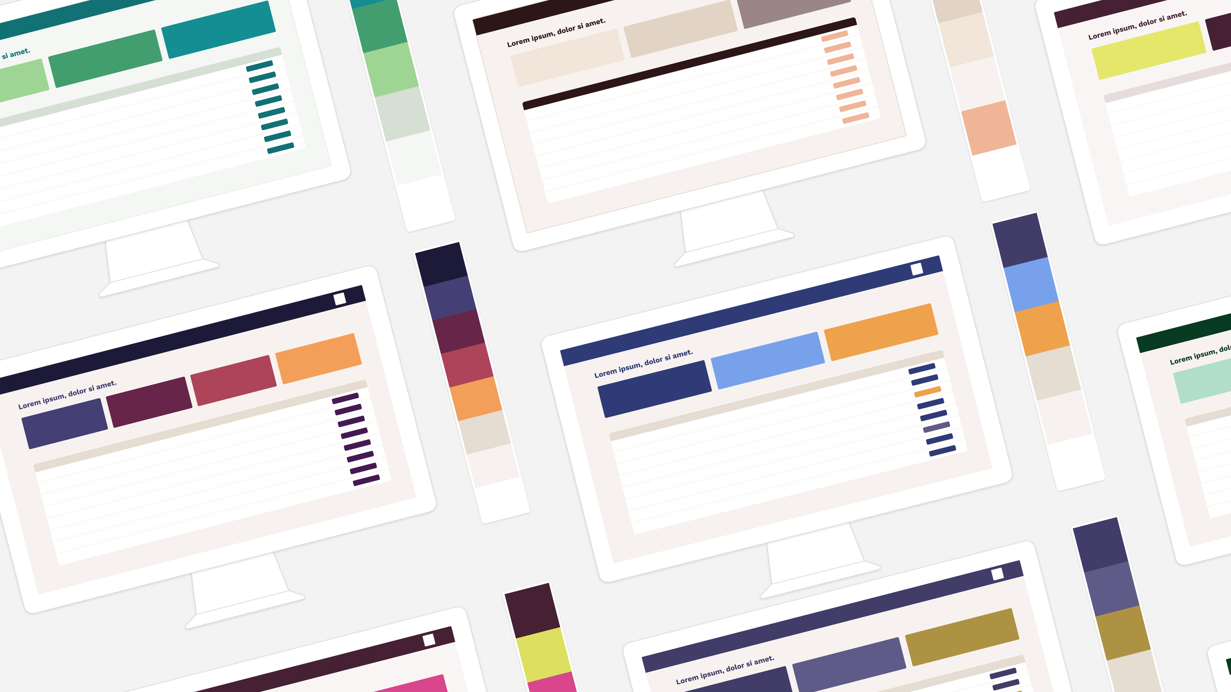
For example, each of the mockups below is arguably functional, but some are more likely to lead to a “Wow, I love it!” reaction from users.
Early on in my design career, I got a reputation as someone who’s “good at color” and so I wanted to share some tips from 20 or so years of working with color in digital experiences. This is part science, part lived experience, and I hope it helps take some of the stress out of working with color. This article will be divided into 2 parts, because there’s a lot to say about color. I think it’s foundational to good design. In fact, we put substantial effort into making sure our data insights solution, Rover, was designed to handle branded colors nicely for exactly this reason.
But just having brand colors isn’t always enough. Let’s look at a common question we help clients work through.
We’re working on a rebrand of our app/software, and we have this one color that I absolutely love and some people on our team hate. How do we solve this?
I want to set your mind at ease that this is normal: if you have more than one stakeholder, it is impossible to craft a palette in which every person loves every color (and if you did, the net effect would probably be ugly—more on this next week). So, all of you should attempt to step outside of “do I like that specific color by itself?” and ask “Is this color doing its job in the overall palette?”
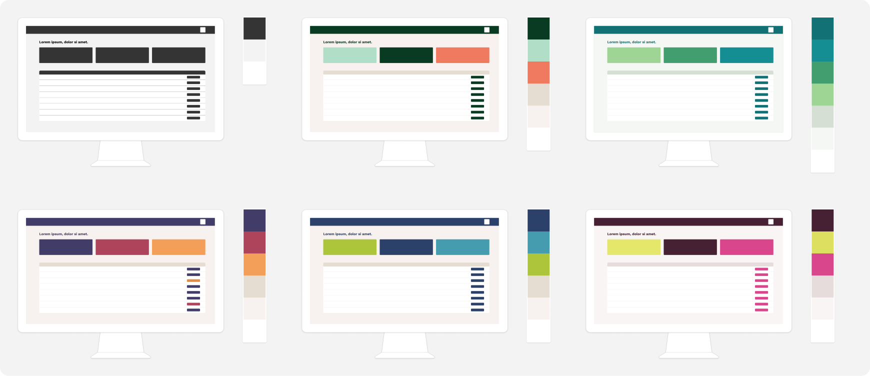
That can be hard to recognize when you’re just looking at squares on a slide. I highly, highly recommend you ask the team executing the rebrand to present the palette by mocking up actual screens in your actual application. And not just the most aesthetic screens like a dashboard—ask them to mock up an ‘average’, data-dense screen in the application. That will help you all understand how the colors play together.
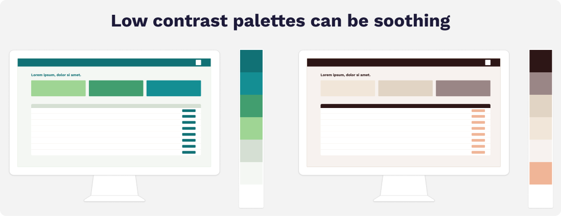
Often there is a color or two in the palette that by itself is a bit jarring, but in the context of a screen, it’s providing needed brightness and balance. In our brand palette, that’s the orangey-yellowy-brown color, called Sandy Brown, or the bright orange called Bittersweet. You can’t use very much of either one, but in small doses, one of those colors is the thing that makes the screen come together. Over the years, all sorts of unusual colors I wouldn’t like on their own have served this role in clients’ brands: highlighter yellow, lime green, neon green, mint green, bright aqua, tomato red, salmon. It’s not about the color itself — you’re not painting your living room that color. It’s about how it plays in the palette, and often, the palette needs an ‘agitator’ color that gives it an injection of energy, even if too much of that color would be off-putting.
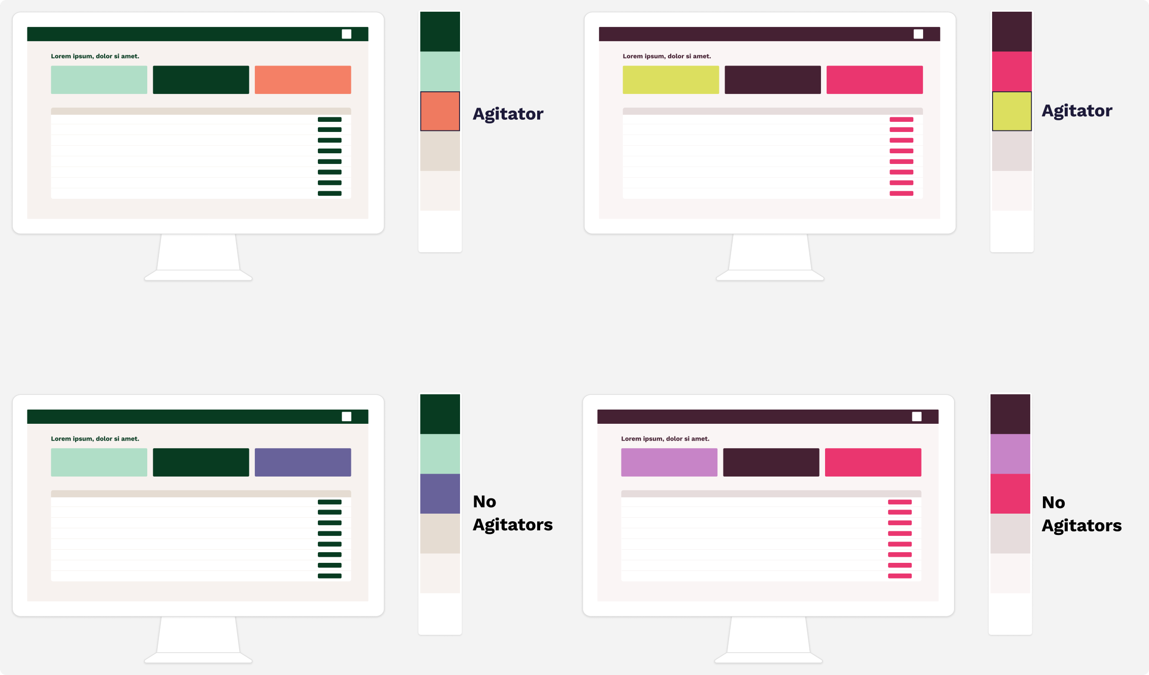
In the mockups below, you can see how replacing the agitator color with a color that contrasts less with the palette completely changes the vibe. If you’re looking for something calm and soothing, maybe that’s what you want (more on this later). But if you’re looking for dynamic energy, you may want to keep the agitator color.
Step 2 is to consider if there’s a valid rational argument as to why that color won’t work. Examples from the years are:
Used prominently + too close to a competitor’s well-known color. You want some level of differentiation—copying a color a competitor is known for is not helping (i.e. Ally Bank’s competitors should probably avoid purple). This doesn’t really apply to blue in most cases—so many products use blue prominently that it’s not strongly associated with any one brand in most cases. This may be its own reason to avoid blue, but it gets you out of looking like you’re mimicking a rival.
Used prominently + antithetical to the desired mood. Tomato red would be a poor choice for say, a spa, because it has the wrong energy. Spas are meant to be relaxing, which is why you see a lot of gentle cool color schemes or neutral colors. Tomato red is too bright and too hot, so it conflicts with the mood.
Too hard to use. This doesn’t really eliminate a color from the mix, but limits how it can be used. Due to color contrast ratio requirements, colors in the middle of the light-dark range are often harder to use. They’re too light to put light text on top, but too dark to put dark text on top. You can still include these midtone colors, but recognize that they’ll play a limited role. Again, mockups help with visualizing this.
The second problem is the emotional problem. You and your colleagues likely feel a great deal of ownership in the product. You want it to bring your beautiful vision to fruition. That can make things like a color choice take on much more personal undertones. Try to let go of this. Parents need to recognize that their kids won’t be perfect copies of themselves, and visionaries need to recognize that what’s most important is that the product’s look and feel serves the audience, not their own personal taste. That’s not to say you should accept a design that you don’t like. You need to be proud of it and excited to show it off. But try to avoid steering the early conversation too much based on your own personal tastes.
I’ve learned this one from experience. I like green a lot, and when it came time for our rebrand, I broke all the rules and led with my preferences early. I wanted it to be green. Specifically a lush, blue-toned green with a hint of gray in it. But it wasn’t working. Even as a “color person”, I was messing things up.
I may love green generally, but that’s a preference formed on a wide variety of life experiences: clothing, home decor, art, landscaping. It won’t always translate to the screen. When I let go of the belief that it had to be green (which if I’m being honest, was not based on a professional evaluation but on what I like for myself), it opened up for us to find something that truly worked for our brand. So try to keep an open mind and let the product be what it needs to be: shaped by you, but not a direct copy of your tastes. I have plenty of outlets to enjoy green: my clothing, our landscaping, our art, etc. It doesn’t have to be reflected on the screen.
If it’s just not coming together, look for where you (or your fellow stakeholders) might be bringing too much personal life preference into something that needs to be influenced by the product vision, not your tastes in your life outside of work. This will feel like a loss at first. Don’t worry, the sting goes away quickly when you see things start to come together.
And on that note, you may be interested in how to make it start to come together.
What are some basic tips on how to use color to evoke a personality for your app?
You can find all sorts of conversation online about what various colors mean. “Purple means trust” or “Orange signals creativity.” Some of these have merit, but in most cases it’s an oversimplification. Some colors of purple may signal trust, but others may not. A midtone lilac is more whimsical than serious, for example, and that undermines trust. Orange might signal creativity to some; to others it might read as a warning. So if those rules don’t tell us how to use color, what can we do?
One of the key things I think about is color contrast and harmony.
Picking a palette that provides high contrast (white and black, blue and orange, red and green) by choosing colors opposite on the color wheel creates a dynamic, high-energy feeling. You see this often — it’s why there are so many blue and gold websites out there. And yet, it’s not always the right choice. Specifically blue and orange/gold is so commonly used that it won’t help you stand out. That said, it is pleasing. If you’re new, maybe what you want is to evoke the trust associated with more established brands by emulating their colors.
But sometimes, you want to evoke a more peaceful feeling than what you’d get with all of that color contrast. For example, when we worked on an app for caregivers, we created a very earthy palette with a lot of emphasis on neutrals and gentle use of teal, green and brown as accents. This created a very soothing interface—great when the user is already under stress.
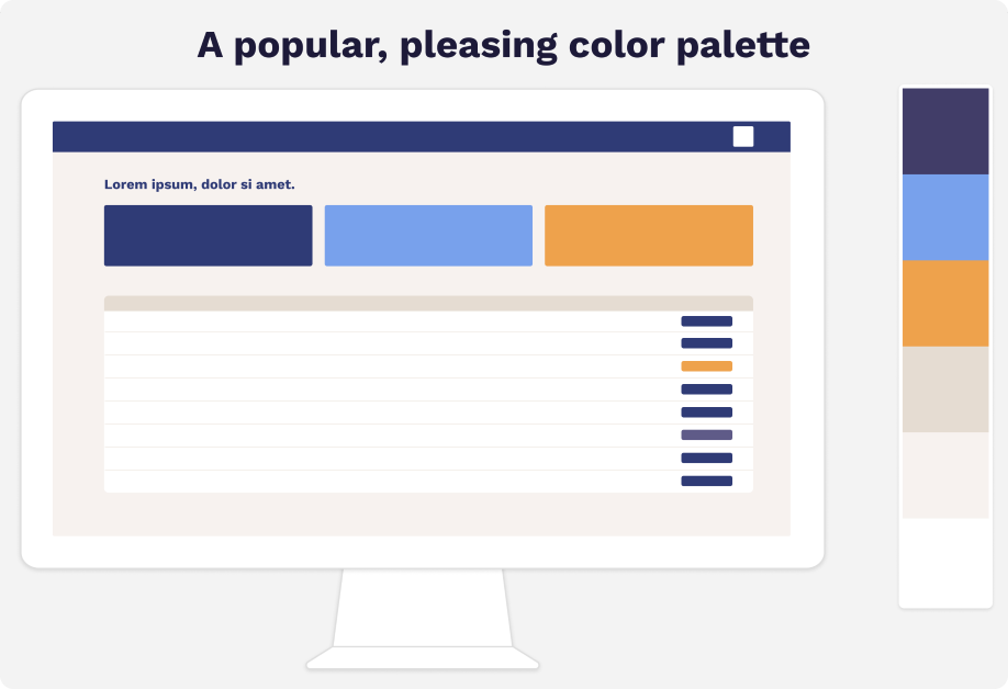
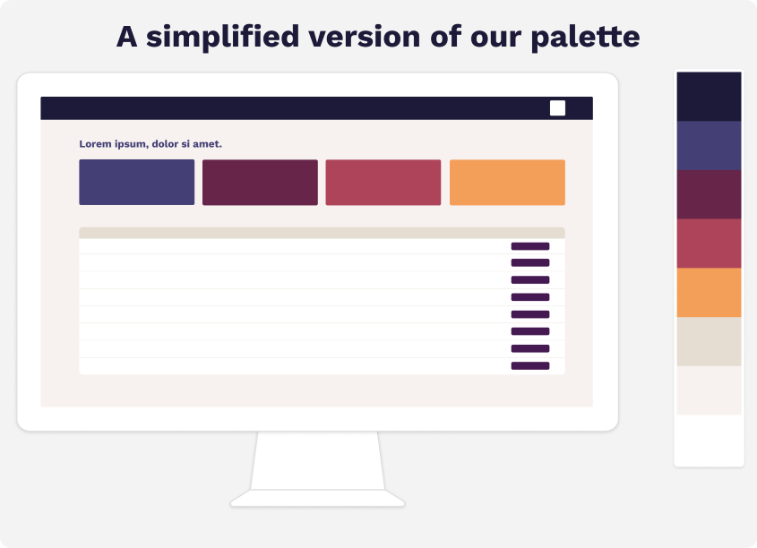
Our own color palette uses a split complementary palette, which is just designer speak for saying there are elements of deep color contrast (purple and gold) but also harmony among the rest of the warm palette (reds and golds). We wanted something warm, energetic, grounded and an antidote to all of the ‘cold’ tech sites you see out there. Even our ‘whites’ are actually a very light peach.
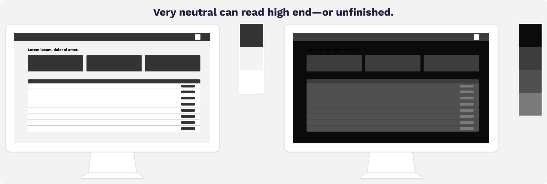
While lots of color works for many brands, in some cases, it may be appropriate to consider very little color. Think about ChatGPT’s interface, for example—it’s almost entirely black and white. Okay, technically, it’s very dark grey that reads black, and very light grey that reads white, because pure black and pure white would be hard on the eyes. Going almost no-color can read high-end (think designer fashion), but it can also read ‘unfinished’ or ‘low effort’. A product that eschews color must appear very intentional with its other stylistic choices (fonts, spacing, alignment) to avoid this trap.
Don’t let color intimidate you
Color problems are solvable just like any other design issue. The fact that there’s personal preference involved is not a reason to shy away, it’s a reason to get curious and creative. Next week we’ll dive a little deeper into common color ‘gotchas’ and what’s going on when you followed all the rules but it’s still, well, ugly.
Until then, onward & upward, friends.