
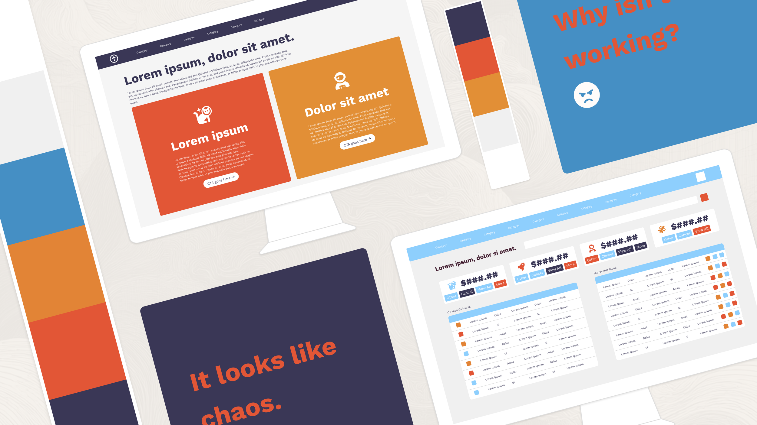
Why Great Colors Can Still Make Ugly Software
Last week, we talked about a common question around what happens when the team has strong and diverging opinions on color. This week, we’re looking at another common challenge: when you’ve agreed on the palette but things are still coming out, well, ugly.
We’re using our brand palette, which we all love, but screens are still coming out looking kind of amateurish and ugly at times. What’s going wrong?
There’s a misconception out there that having brand standards is going to ensure no clunkers. It doesn’t work that way.
Having well-crafted brand standards helps get you closer to the ballpark of something that works, but there are still all sorts of pitfalls. I’ll list a few common ones here but there are probably dozens of ways this can go wrong. If you’re struggling, feel free to get in touch with us for help.
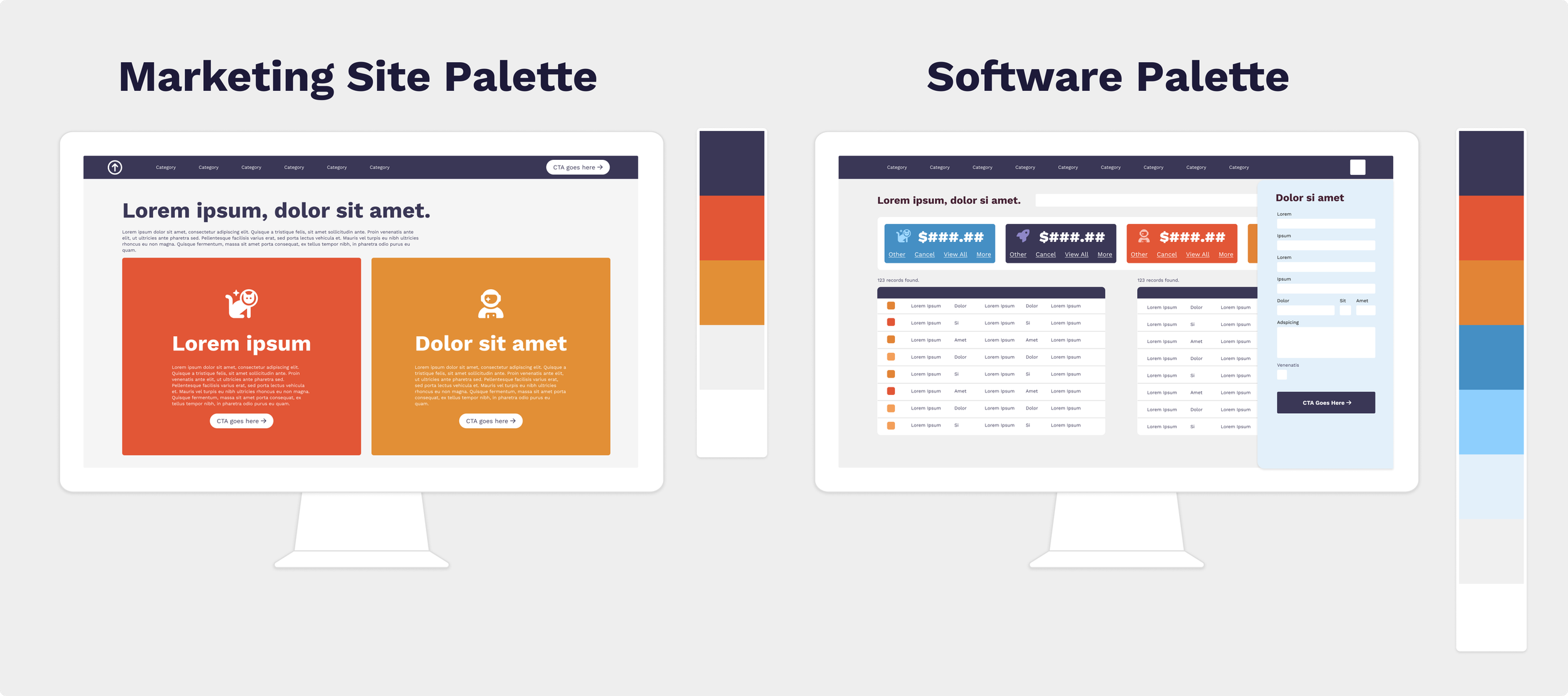
Your brand palette was designed for marketing and needs to be adapted for software
Software is typically more information-dense than marketing materials, and people often spend more continuous time in it than they do with marketing materials. This means that there are some additional parameters to design for. We need to be sure the most important information stands out without overwhelming the user’s eyes. Therefore you likely need a few more colors (perhaps tints and shades of the brand colors you already have, in addition to some functional colors like an error or warning state) and it also means they need to be used quite carefully in terms of contrast levels. Software uses smaller fonts than most marketing materials, and that means you need a higher contrast ratio for it to be easily readable. Therefore your lights need to be lighter and your darks need to be darker.
It’s also true that at small font sizes, similar colors can blend together, so you may need more color differentiation.
All of this is normal and to be expected, no matter how fancy your branding agency is. We once worked alongside Frog Design (yep, the Frog Design of Apple fame) to craft software for a brand they’d developed. I was a little in awe and expected them to come in with a big attitude given their stature. You know what they did? They told us very humbly that it was a starting point, and they knew we’d need to add to it. They were right, and I’d argue that was the best and most professional way to handle it. They did a knockout job on the branding for the overall company, and left us the wiggle room to do what we needed to do to make the software just as stunning.
In the example below, we can see that a common blue and orange color palette is used on the marketing site. There, the largely 3-color palette (with a light grey and white thrown in) looks sharp and modern. However, the software mockup on the right has a lot more elements. It needs the balance created by adding tints and shades of the marketing palette.
Your colors are scattered like a sprinkle donut
On an information-dense page, scattering small elements of different colors throughout looks messy and is hard for the eye to follow. It’s like approaching a house with dozens of little garden gnomes and sculptures in the front yard: your eye doesn’t know where to look. Grouping elements to form larger areas that break up the page gives it more balance.
Let’s look at an example. Both of the mockups below use a technically strong color palette. But the one on the left uses small bits of color scattered throughout. It’s as if someone dumped out a bag of sprinkles on the software. This is hard for the eye to make sense of. There are a lot of elements and no clear visual hierarchy, so they compete for attention. That chaos can start to read ‘ugly’.
On the right, however, we’ve used almost the same palette (adding one significant color and a couple of tints) but provided differentiation for large sections: a dark navbar, dark table headers and background colors on the metric tiles instead of the buttons that sit on them. The result is easier to look at because the elements read as ‘grouped’.
This isn’t just aesthetically pleasing—it reduces eye fatigue for users who spend all day in software.
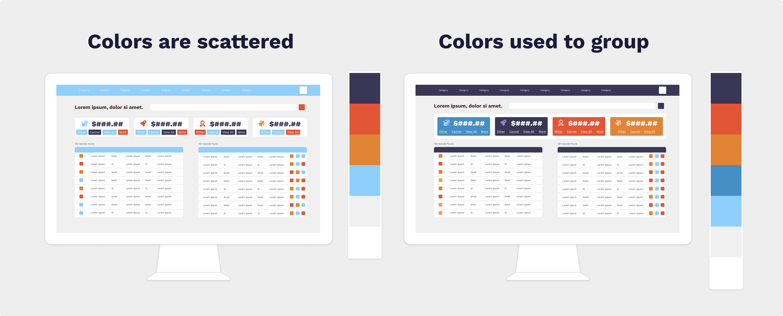
The more information is on the page, the bigger your groupings need to be. It’s a bit like how in interior design, the larger the space is, the larger the furniture should be. Scaling your groupings to your page size creates balance and eases the path for the eye.
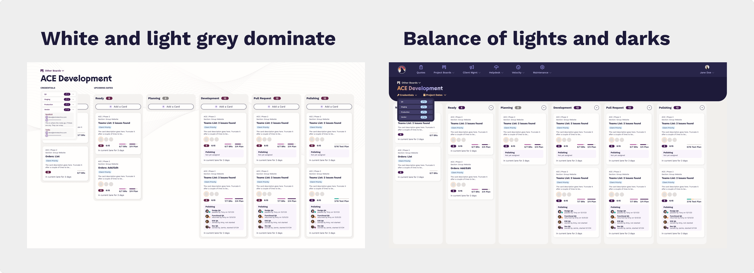
You’re afraid of the dark—or any background other than white or light grey
In studies, users pretty overwhelmingly prefer dark mode. There are a lot of functional arguments for why this is better, especially for users with certain neurological or vision conditions. At the same time, the majority of users without specific vision issues prefer dark mode as well, simply because they like how it looks.
Many brands, however, assume light mode all the time in their branding and aren’t prepared for this.
You don’t have to make your entire app all dark mode (though if you have the budget to do that, users who prefer dark mode will appreciate it). Even if you don’t go full dark mode, you may squeeze some aesthetic and functional benefits from separating out specific sections and making them appear dark mode. It gives the eye something to focus on to break up a large, information-dense page. We’ve gotten a lot of mileage out of this particular trick in various apps that need a way to break up data.
You can also stray from the monochromatic palette of whites and greys by using some backgrounds that incorporate a color that works with your palette. For example the screen below uses a very light purple.
Creating this contrast gives the page a center of gravity, and it also helps combat eye fatigue. But what most people will probably notice is that it’s more aesthetic. Those art teachers were right—contrast is your friend in design.
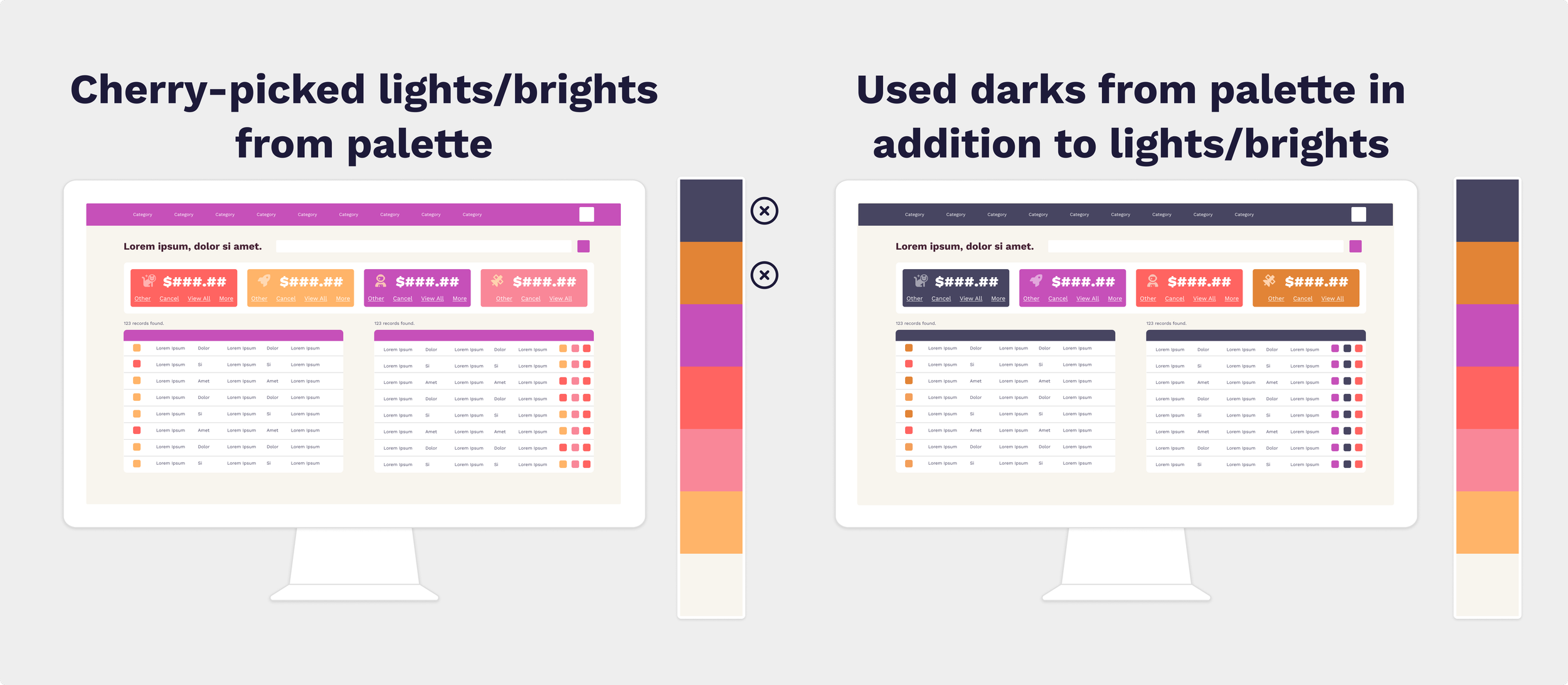
You’re using only the ‘pretty’ colors from your palette
As we discussed last week when we covered why color is hard to agree on, everyone has colors they like more than others. The ones you don’t like as well probably still serve a purpose in the palette, providing lights or darks or brights or neutrals to keep things balanced. There’s a weird phenomenon where if you make something with only the colors you like, you may end up disliking the end result.
I experienced this early in my career. I worked with a client who wanted to direct a lot of individual design choices, from shadows to gradients to colors to fonts. She was adamant and unwilling to bend, even when nudged with gentle industry wisdom. Finally, I gave in and gave her what she said she wanted, despite my better judgment. She was happy—until it came time to launch the thing and she realized seeing it live that all of those individual choices that she liked added up to a whole she didn’t like very much.
That project taught me a lot. I learned that some client relationships aren't the right fit, and we updated our process to identify that earlier — before we’re knee-deep in fuchsia gradients. We also added checkpoints to be sure the client is fully picturing the end result as we go. But one of the most important things I learned is that the overall visual effect requires balance. Most of us have been in that client’s place, whether picking out tile for a bathroom or staring at a wall of paint chips trying to picture the room. Someone with strong opinions can inadvertently derail the process by making choices individually instead of as a whole. And that tendency may play into how your palette is being used in your software.
So, if some challenging colors from your palette are being avoided, and yet there’s something ‘off’ about the end result, it may be that the team needs to spend some time learning how to work with even the tricky colors, so you can create that balance. So pull out that dark brown or that chartreuse and learn how to work with it.
The example below is an extreme one that probably wouldn’t work for most business applications. However, it showcases how those ‘less pretty’ dark colors help ground the palette and make even a very intense Starburst-themed color scheme work better. Again, not normally what anyone would choose, but useful for making the point.
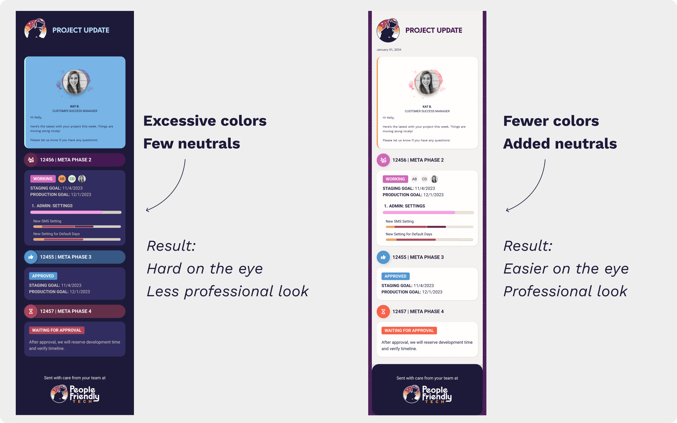
You need some editing—and some neutrals
While too much color is certainly less common than not enough color, color drought does happen. This is most prevalent when there is a strong marketing presence, and the team tries to use the same tricks in software. As we discussed earlier, software is just different from marketing. The information is denser, the focus is task-oriented instead of exploratory, and the user is often spending a lot more time on the same screens repetitively. It makes sense to adapt the rules.
Namely, even if you don’t really use a lot of neutrals in your marketing, you’re going to need them in your software. If you don’t want to use standard greys, you still have options. For example, in our palette, we have some warm alabaster colors and a very dark blue that both serve as neutrals. This balances out the intense red, gold and purple colors in our primary branding.
In fact, when we went to rebrand our internal software to match our outward-facing brand, we added several tints and shades of those neutral colors to the palette. We didn’t need them for our marketing materials, but we did need them to ensure we could create hierarchies and visual clarity in the more complex software screens.
Here’s an example of an email done in only the bright colors from our palette, vs. one created with an edited palette including both brights and neutrals.
Your darks aren’t dark enough or your lights aren’t light enough
This is a variation on the “your marketing branding may need some thoughtful adaptation to work in software” theme, but it’s so common, I wanted to mention it.
Many times you’ll hear from users that an app “needs more color”. So designers, ever eager to please, throw in some colorful buttons or icons. Problem solved, right?
Not always. In many cases, your palette will have colors that gravitate toward the middle in terms of value (how light or dark they are), yet the design really needs lighter lights and darker darks. Too many midtones make the app feel ungrounded.
Check out the example below.
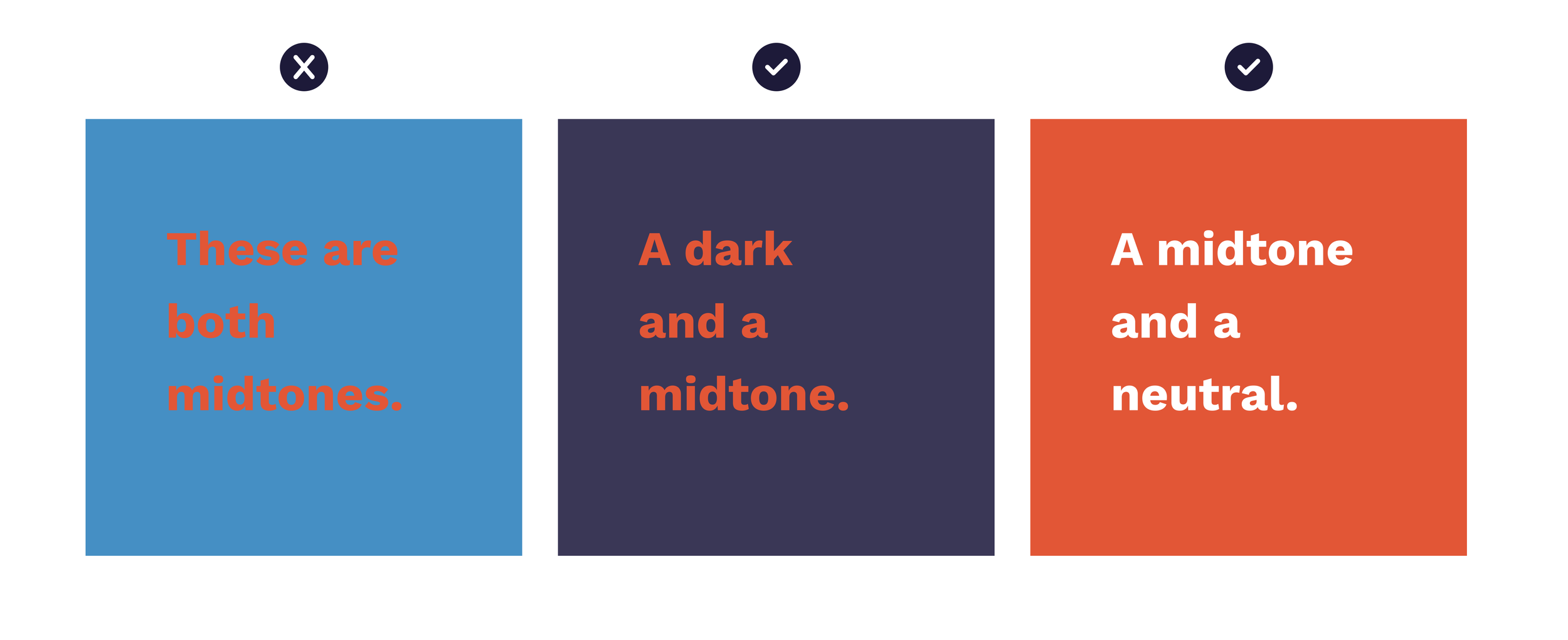
Notice how midtone on midtone is hard to look at? The example on the left is particularly bad because it uses opposite colors on the color wheel AND both are midtones. It makes a great illustration of what not to do. The middle example still uses opposite colors, but because the blue has been darkened, it doesn’t ‘sizzle’ on your eye. The right example has swapped the blue for a neutral (white) which nearly always works as long as there’s enough contrast to be legible.
Color problems often stem from one of the above issues—or variations of them.
Your brand palette probably isn’t broken—it might just need a few adjustments to the palette itself, but also how it’s being used. You can do it! And if you need help, we’re here. Using color well isn’t just about aesthetics. It also makes the software easier and more pleasant to use. Isn’t that what we all want?
Onward & upward.