
The Epic Tale of Making Better Chart Legends
Some of the most impactful design work we do is in decidedly un-glamorous areas: MFA screens, notification preferences and the like. Recently, Product Design Lead Tony Leo and I set out to conquer a fearsome beast: chart legends. We undertook this quest on behalf of our data visualization product Rover, and the clients who use it.
It started out simply enough: we noticed that the charts provided by D3 (a popular javascript charting library that we use) weren’t as helpful as they could be.
The legends weren’t displaying the data values (arguably the most important information on the chart!). The values were only shown on hover over a pie wedge or a bar. Okay for some situations, but impossible to scan, doesn’t print well, and not very accessible. Rover is all about making data actionable, so this wouldn’t do.
Aesthetically, they didn’t look great. The way they were being rendered by the third-party library meant that they were sometimes cut off, or almost-but-not-quite centered, etc. Making everything look nice is one of the hallmarks of Rover, so we needed to do better.
They varied in size and because of the way they were being rendered, this caused problems in dashboards where we want everything to lay out nicely in rows and columns. A chart tile might not be the same size as the one next to it if they had a different number of rows, and that looks ugly. Our clients don’t have to settle for ugly.
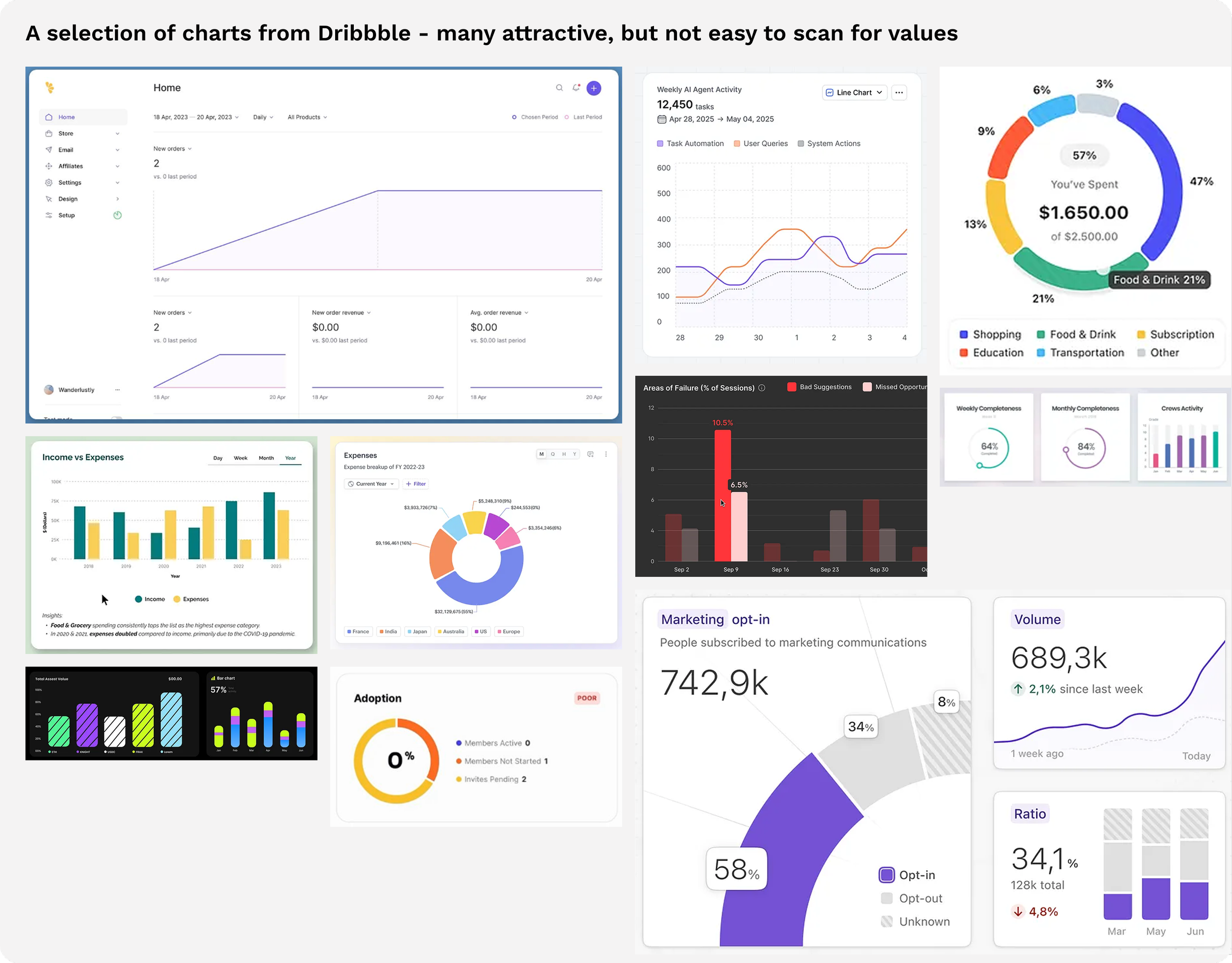
In the beginning, we underestimated the difficulty of our foe. There are millions of charts in business. Surely someone has already figured all of this out and there is an established pattern. Wrong! A quick survey of chart inspiration reveals that many beautiful charts on Dribbble and the like simply omit the legend entirely. Looks slick in a screenshot, perhaps, but not very useful in business.
We were going to need to forge new ground, so we had a meeting to strategize. As we were talking, a few priorities emerged:
We needed solutions that handle the various permutations of dashboard layouts: from full width to ¼ width.
A solution for our built-in export to PDF. It’s very common in business to want to share a nice-looking PDF with some other audience: the board, a leadership group, or a client. If the export doesn’t include the values, it’s not very useful.
We needed to account for bar, column, line, donut and pie charts.
Column charts came in two flavors — bars that stand for time (this month, last week) and bars that stand for things (each salesperson) — and the legend had to do the right thing with both. Two problems bearing the same flag.
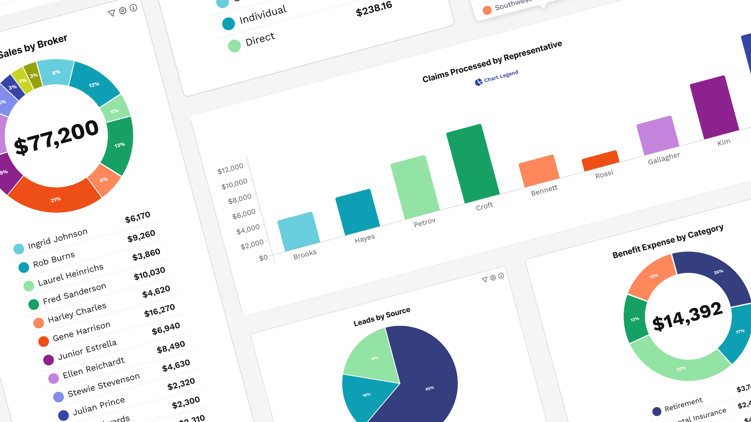
Sometimes there may be just a couple of segments, such as a pie chart with “Done” and “Not Done”. Other times, there may be up to a dozen segments (we cap at the top dozen values for scannability in pie charts and donut charts, condensing the rest into an ‘Other’ category with a clickthrough to view full results). The legend solution would need to handle both and look good and scannable in either case.
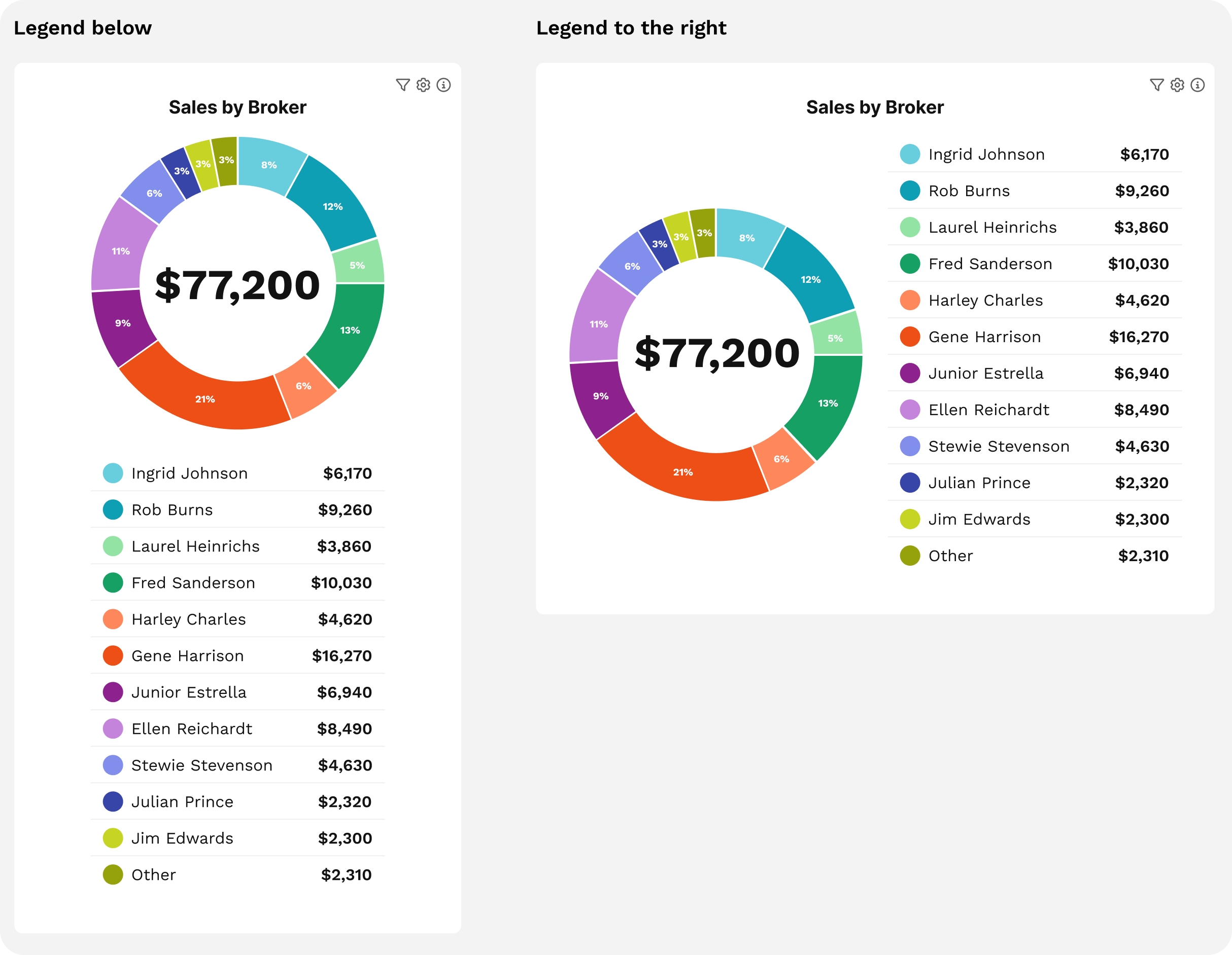
We were hoping to find one legend style to rule them all, but after slogging through several examples, we realized that there were too many potential situations: sometimes a legend below makes a lot of sense. Other times it’s not great. Sometimes a legend to the side is perfect. Other times it looks weird. (The below example with 12 options is a worst-case scenario, but it’s important to design for the worst case.)
Our next thought was to make the choice of where the legend would live automatically based on the type of chart. However, charts don’t exist in a vacuum, they often appear as just one tile of a dashboard. So the person designing the Rover dashboard needed to have some flexibility to make choices based on the overall dashboard layout and the purpose of the data.
Finally we scored our first victory, deciding on making legend position configurable, with some smart defaults. And there we had to pause and shore up our position, because we needed some more detail on exactly how these legends would look.
Tony worked on several mockups, focusing on how it looked both for the smallest case (2 values in the legend) and the largest case (12 values in the legend). He had some past experience working with custom D3 legends, so knew what was possible by using hooks to write our own code vs. taking the standard legends.
Showing the value, not just the name and color, was non-negotiable. The question was which value. Percentage would be the obvious pick for a pie chart — except the chart already shows that. What a leader actually wants to know isn't just that Gene did 21% of sales; it's that Gene sold $16,270 last week which was 21% of sales. So value won in the legend; the percentage already lives in the chart.
We considered showing both percent and value, but it significantly muddied the display. For a dashboard approach where there are likely multiple charts, it was just too much. So, Name + Color + Value won the battle. We had a nice, scannable legend that doubled as a list of values.

But the war wasn’t over yet.
Aesthetics
We had a functional legend, but it wasn’t quite up to our aesthetic standards yet. One thing we noticed is that sometimes the legends were just…a lot.
We also threw in a triggered option where the legend didn’t show by default but could be triggered by clicking a button. This would be used for when space was tight, or when the visual display was mostly enough to understand the data but we needed the legend for backup. Part of helping people understand data at a glance is keeping unnecessary elements out of the view. We anticipate that the legend is normally useful, but not always, so we wanted a way to de-prioritize it.
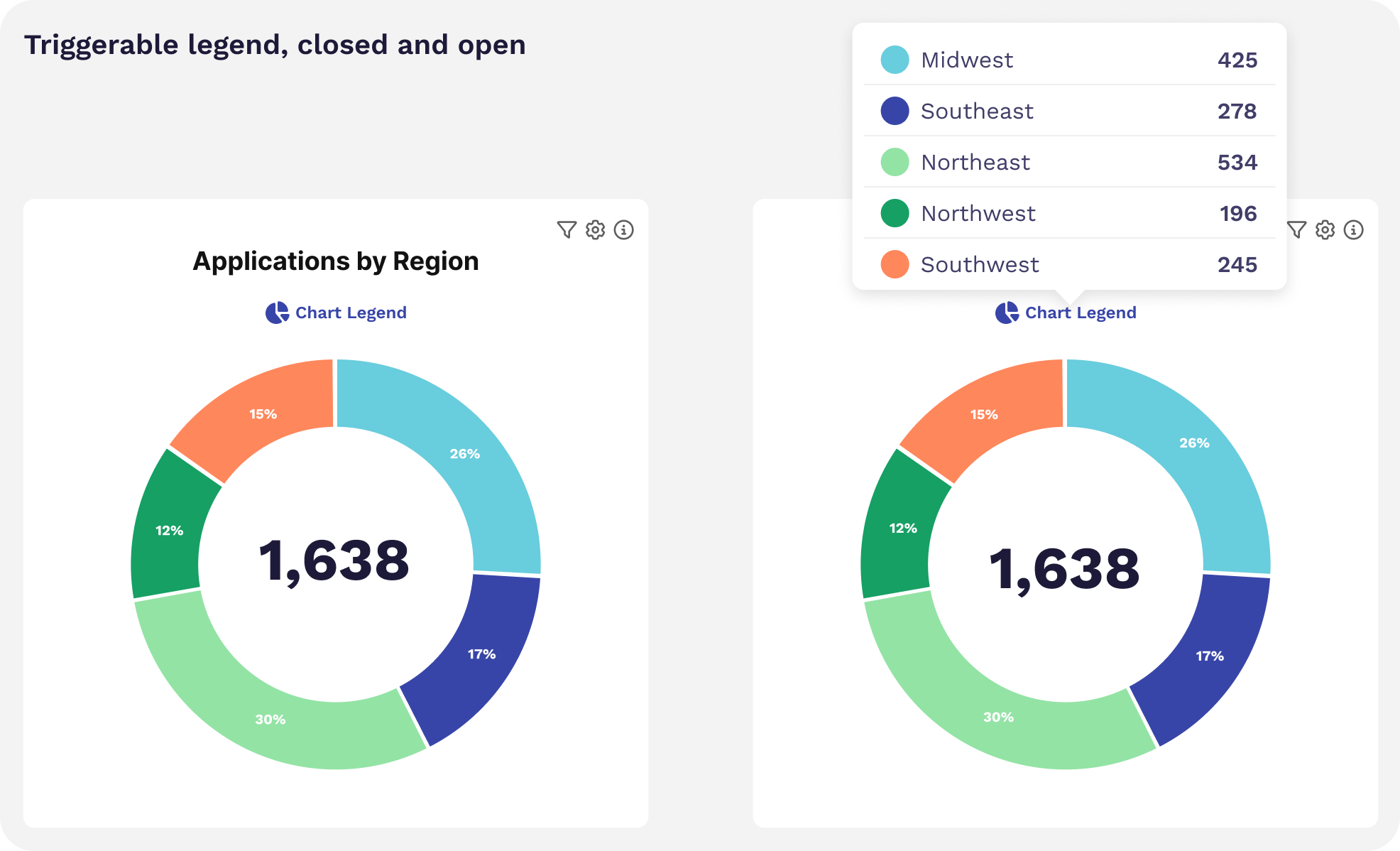
Of course, that meant that we were back to needing a separate solution for printing to that PDF, as we couldn’t leave the export out in the cold without the values. So, we added configurability when using the triggered option to choose a bottom or right legend when printing.
At this point we knew we were close to defeating our foe, but there were a few items left to tidy up.
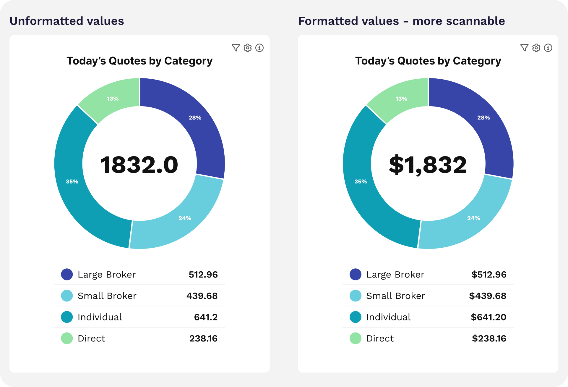
One was formatting: nothing makes a platform feel robotic and inhuman like values that read ‘56.0’. So we wrote a business rule to ensure that any formatting applied to the column, be it integer, currency, etc., carried through the legend.
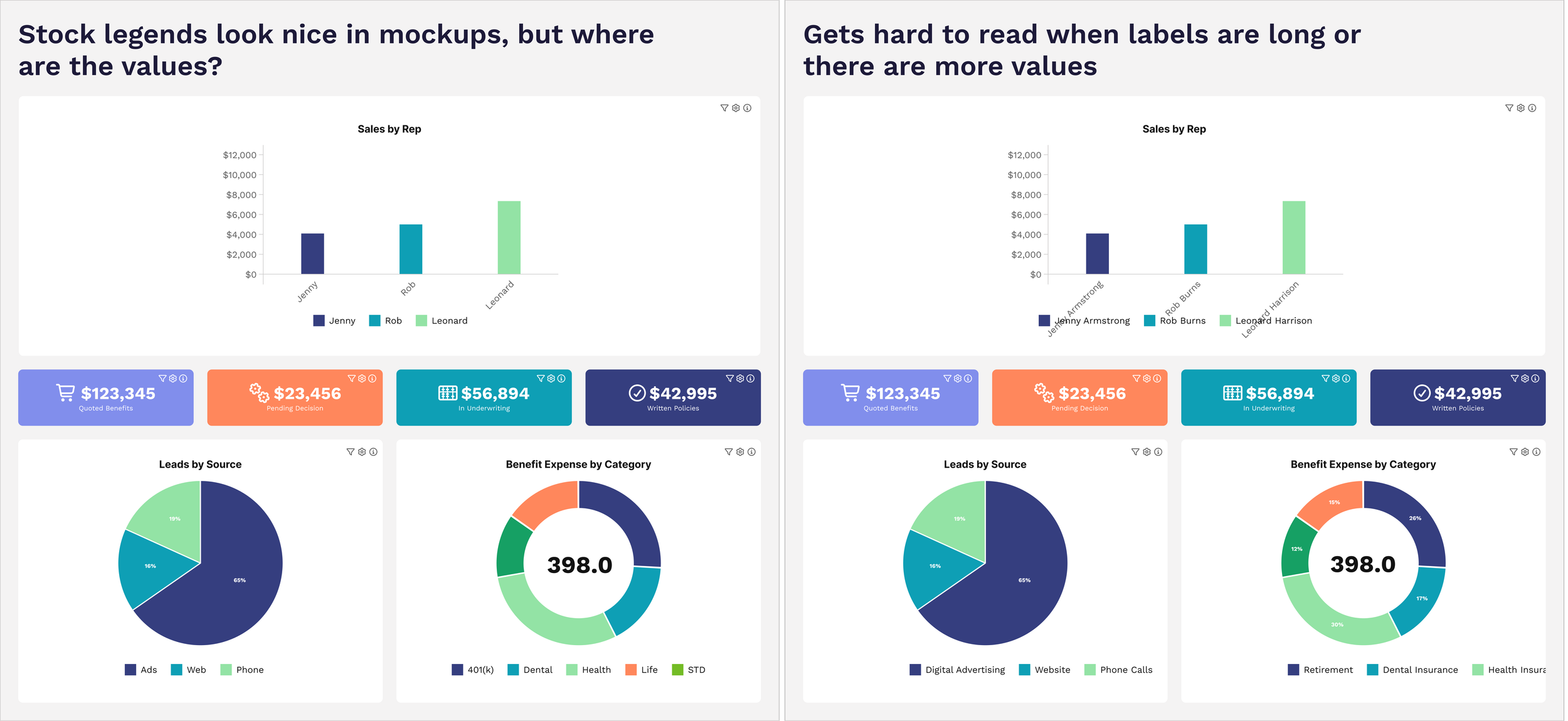
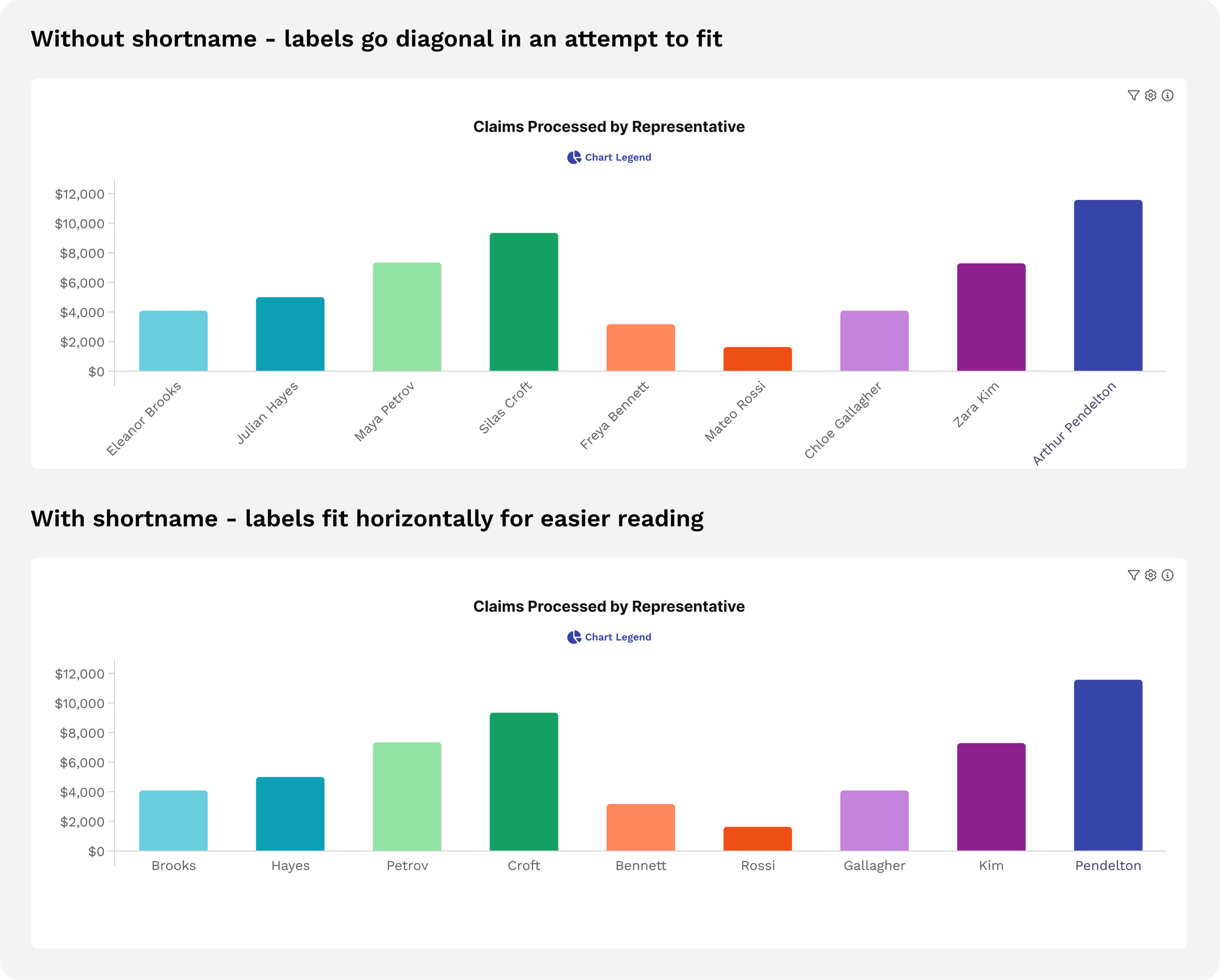
Just when we were ready to declare victory, we hit another problem: on column charts, D3 tried to display labels under the bar, but if the labels are too long, it switches to angled text. This is practical and understandable to find a way to make it fit, and yet it’s ugly as sin and seems to have some weird interactions with legends positioned below it, which sometimes overlap the angled text. Because it’s not great, we’d like to decrease the incidence of users running into this in the wild, so we added the ability to configure a ‘short label’. This would be used only on the x-axis, with the full label used in legends and tooltips.
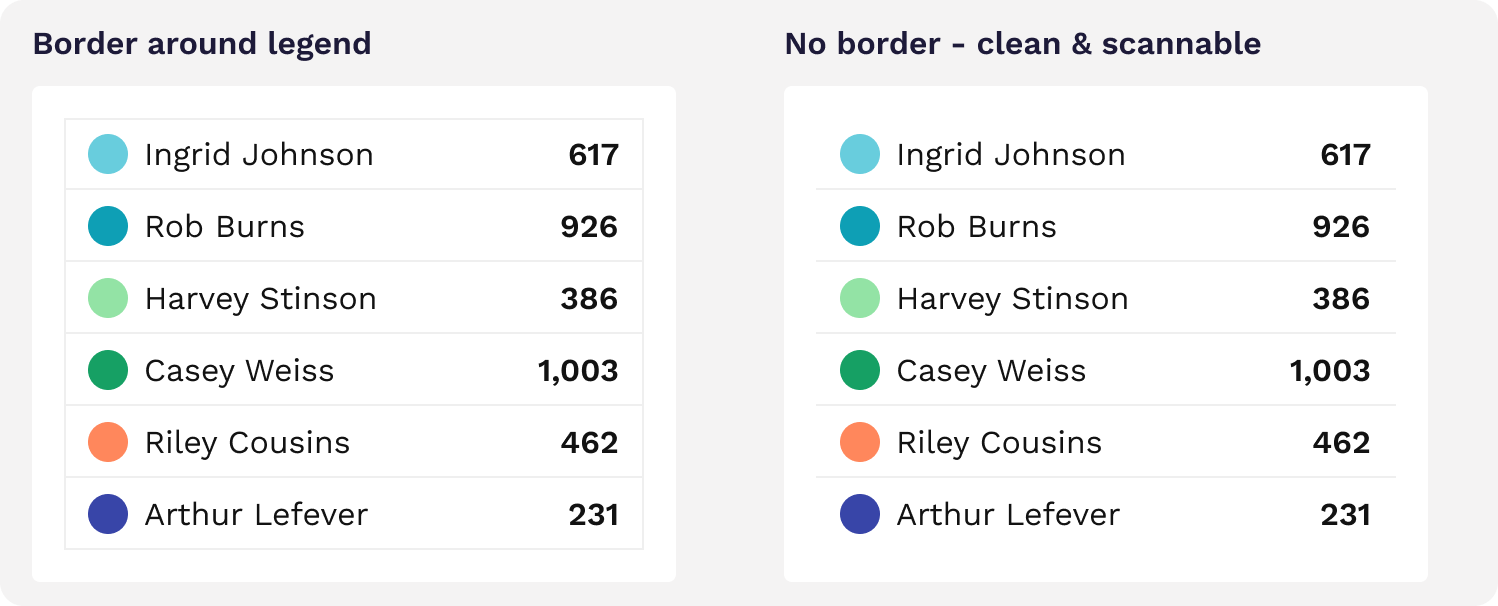
We were getting close enough that we could smell victory in the air. Fortified by success, we pressed on, setting our sights on a smaller element: the shape of the color chip. You commonly see these as squares. Squares are not ideal because some clients have brand standards with varying levels of roundness for corners. While we have the ability to style this per client, it’s a small square, and there’s a pretty narrow range that would look decent. Very sharp or very rounded corners would look distracting (I’m looking at you, Microsoft Excel). We swapped the conventional squares for circles, because they work with any branding and aren’t subject to weird variations. We also eliminated the border which often looks ugly. We have a standard to make sure all chart colors are dark enough for white text to be legible on top, meaning the border isn’t necessary.
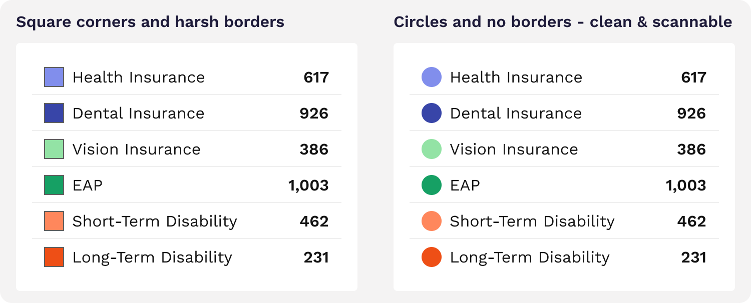
With the end in sight, we opted to remove the bounding box on the legend. Using just the horizontal lines between rows was a tad cleaner visually and matches the display style of most Rover reports.
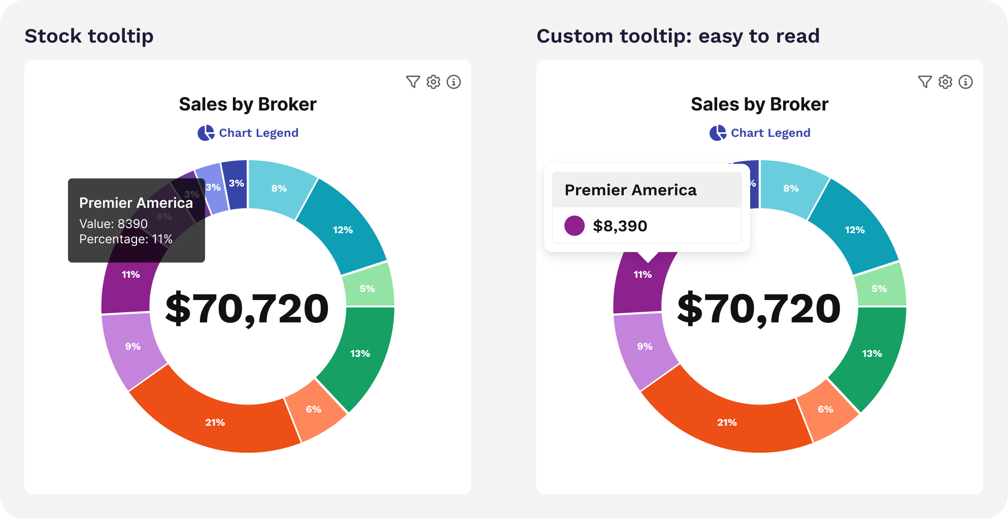
Our last step was to revamp the stock tooltips that come with the library to match our legend.
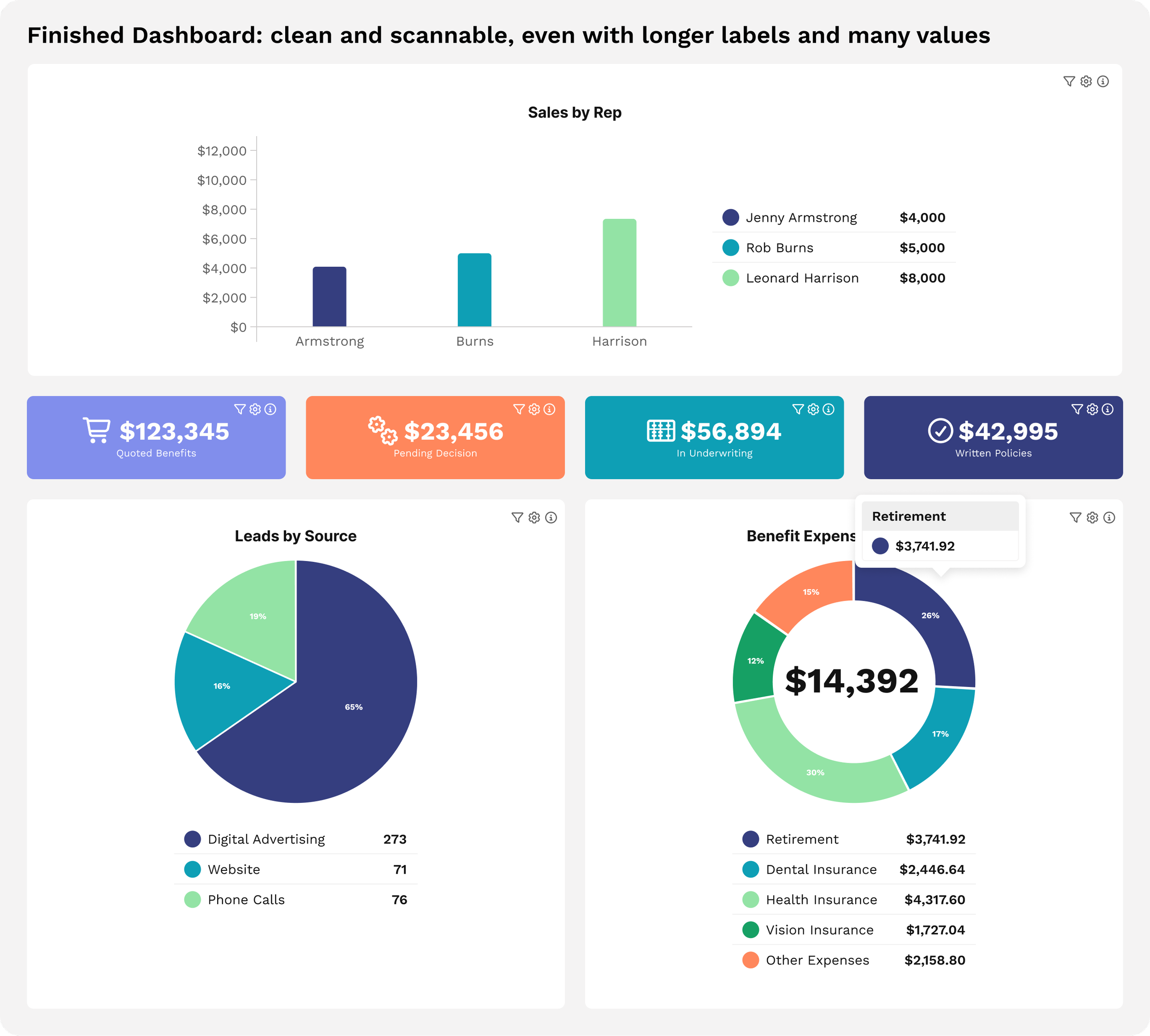
Now the entire dashboard feels light, cohesive and smooth AND is scannable at a glance. Victory at last!
Once the design was done, our intrepid engineering team brought it to life. Mihailo took the lead on this one, coding the designs into reality with flair.
All told, about 1.5 person-weeks went into revamping our chart legends. It may surprise you to know how much effort goes into a small element you see every day. These details are the kind of thing we get excited about, and allow us to create a product that’s meaningfully better for our clients. As the dust settles on the UX battlefield, we ride off into the sunset, chasing the next clunky element to slay.