
How to Fix Boring Software (Even Your Own)

We’re days away from launching a pilot for a product called Rover that’s been in the works for two years. If that seems like a long time to you, I assure you with a weary sigh that it is. This particular project is our own product, and thus has been relegated to getting attention only when we can squeeze it in between client projects. As a typical Green Shirt (aka Visionary), this chafes against my innate sense of urgency more than a little. Once I have an idea, I just want to see it out in the world as quickly as possible. But such is the game one agrees to play when a consulting company decides to build their own product.
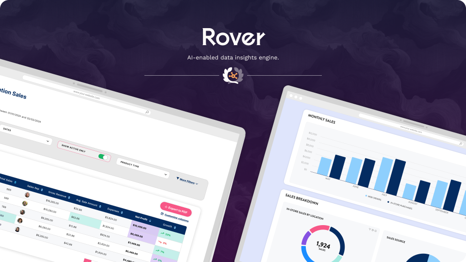
This particular vision is fairly technical: it’s a way to make AI-enabled reporting faster, easier and more secure by putting the engine at the application layer instead of at the database layer (such as PowerBI or a similar solution). It also has tons of intricacies, even in v1: the nuances of how different organizations like dates formatted, preferences on column alignment and sorting, and of course the deeply contentious question of whether totals belong at the top or the bottom of the report. (I’m a top-totals convert, if you must know).
A couple of screenshots are provided below for context.
Our dev team has been toiling away bringing all of this to reality. But even with all of these cool gizmos, as I pored through the Figma mockups a few weeks ago, something seemed to be missing. I knew how functionally cool it was, but it hadn’t (yet) captured the feeling I want people to have using it. And then, like stepping in squishy basement carpet after a storm, the realization slowly dawned on me: I forgot to have fun with it.
It’s a little ironic, because this is a key component of the work we do with clients: focusing on how the user feels working in the software and driving the choices from there. But when it was time to do something for myself, I fell into the same trap as so many other visionaries: as a former programmer, I fell in love with the features, not the feeling. I want to share this with our newsletter audience, as a sort of mini-case study on how you can fix this sort of problem yourself.
The worst feedback I ever gave
The first thing to recognize is that you probably need to get more specific than just ‘fun’.
In fact, the least effective feedback I’ve ever given our team was “We need to make it fun.” We laugh about it now, but at the time, a couple of design team members spent the better part of two days diligently trying to figure out what the heck “fun” meant in the context of sales spreadsheets and win/loss ratios.
I doled out this little gem of wisdom on approximately revision 17 of a complex client workflow. The words were true enough in their own way—as it stood, it was functional but bland, not yet ready to move the needle—but I neglected to provide enough context to help the team see a pathway to apply fun to a topic that was by all accounts, a little bland and buried in numbers.
We finally talked and got to a solution on that client project, but I still look back on it as one of my least effective moments as a leader. So it was interesting to have the opportunity to approach the same situation with our internal data insights product. The situations had a lot of parallels: the bones were solid, we just needed to find the key moments and amp them up a bit so users had a bit of respite in a fairly task-oriented workflow.
Why do we focus on key moments? Because you can’t optimize everything or you’d never launch, and research shows that people tend to remember the emotional peak and the end of the experience, and forgive some dullness in the middle.
A more effective path
In the case of Rover, the highest-stakes moments are:
Admins publishing a report
End users sending a report to someone else
End users saving presets
The first two probably also qualify as the end of a flow, though the user might continue on to other tasks after. These are our candidates for optimization.
Now, we want to take into account what kind of optimization we’re looking for. The first check is whether the functional experience is smooth and sensible. Bells and whistles won’t overcome a clunky experience. In the case of Rover, we’d already solved for the functional experience so we were ready to give it some life, or in other words “Make it fun”.
I should note that the concept of ‘fun’ is both a placeholder and a bit relative. It’s a placeholder because we really mean it should shift the user’s feeling in a positive direction. If they’re dealing with something inherently negative (filing a claim on a life insurance policy, for example), flippancy is not going to come across well. However, in a dry, dense topic that’s a bit lacking in emotion, such as business reporting, some lightheartedness can generate a welcome lift to the experience.
We can think of this like a continuum, with the strongest possible negative emotion on the left and the strongest possible positive emotion on the right. We’re trying to shift people to the right whenever possible.

This is a B2B product where the main emotional risk is frustration, and so shifting right means we want the user to feel successful, like they’ve just accomplished a meaningful goal. The solution? A ‘fun’ animation cooked up by our Product Design Lead, Tony Leo. The goal of this animation is a little deeper than just fun, though. It shows a report turning into a rocket, a well-understood symbol for something launching after a lot of hard work, to commemorate the user’s success in building or sharing their report.
It’s also short (5 seconds) so it doesn’t slow the user down much, but allows them a moment to feel good about accomplishing their task before they move on.
Another benefit is that our team enjoyed working on it and seeing it. Fun is as fun does, and it was gratifying to put our money where our mouth is and invest in this little element just for the sake of making people feel good.
Five days to change the character of a product
The rocket animation took maybe five days to conceptualize and build. That's a rounding error in a two-year project timeline, but it's also the cherry on top of solid conceptualization and development—an element that could be the difference between software people tolerate and software people actually enjoy using.
As we prepare to launch this pilot, I'm reminded that the best technology isn't just functional—it acknowledges that there's a human on the other side of the screen who deserves to feel something positive about their work. Even if that work involves sales spreadsheets and win/loss ratios.
If you're building something and it feels like it's missing that spark, ask yourself: where are the moments that matter most to your users? What are they trying to accomplish, and how do you want them to feel when they succeed? Then give yourself permission to do something that might feel a little silly or unnecessary.
Your users—and your team—will thank you for it.