
What's In (and Out) for 2026

Ahh, December. The time when we wrap up projects from the current year, sigh a little, and start making plans for a fresh, shiny new year. It’s also a time to take stock of what’s ahead and any patterns we don’t want to carry with us into 2026. Should you listen to a woman who owns multiple corgi sweatshirts on the topic of what’s in or out? That’s for you to decide. I’m just the humble messenger. With that said, here’s what we’re seeing that’s in and out for 2026, drawing on the wisdom of the People-Friendly Tech product team.

Out: Bolt-on End User-Facing Chatbots
In: Internal Chatbots
A consequence of the chatbot arms race that occurred from 2024 through mid-2025 is that the industry got to collect a lot of data about what happens when companies outside of foundational AI producers (so not ChatGPT or Claude) deploy their own custom chatbots. We’ve always been pro-LLM but finicky about use case selection (especially end-user facing) due to the potential for harm when things go wrong. Sometimes bets like that are correct, and sometimes they’re not, but you’ve got to take the win when you can get it and on this one, the data is now saying we picked well.
The results are, in a word, abysmal. A 2025 Accenture study of tens of thousands of banking consumers found that chatbots only a 29% user satisfaction rate (less than half that of apps). There are a few reasons for this: a rush to deploy as quickly as possible, inadequate user priming, and lack of access to crucial data. As Michael Abbott, global banking and capital markets lead at Accenture said, chatbots are “fast but stupid.”
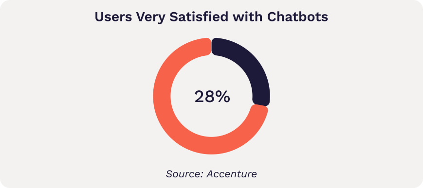
Are chatbots over? No, this just means the industry needs to put down the hype pipe and let its collective eyes clear for a moment, then pick better use cases. In fact, there is a use case that consistently works well and returns positive ROI: using chatbots as internal-facing tools, such as to help customer service agents compose messages back to end users. Something these successful use cases have in common: they keep the human in the driver’s seat, vetting answers and adjusting as needed before they go out.
Out: FOMO-Driven AI Investment
In: Data-Driven AI Investment
Every once in a while (twice now in my nearly 20 years of owning a business), leaders get collectively high on a certain idea, and temporarily abandon spreadsheets and cost-benefit analysis in a rush to not be the ones eating lunch alone by the vending machines. This isn’t a wholly bad thing. Someone has to charge ahead with Four Loko-level enthusiasm and find out what’s beyond the mist. And charge ahead they did, with underwhelming if predictable results. MIT famously found this summer that 95% of AI pilots fail.
That’s probably as it must be in the early stages of assimilating new tech. If companies ever only tested tightly controlled use cases, we wouldn’t learn as much as quickly. Rather than snickering at the companies who tried and stumbled, we should be grateful to them for showing us where the rocks lie across the path. The challenge is this type of speculative investment can hurt small and medium-sized businesses who bet too aggressively and don’t have the runway to see it rebound. Knack prototypes and viral Medium posts don’t pay salaries.
Does that mean the technology goes away? Of course not. Smart leaders just get more clear-eyed about what sorts of AI use cases make sense for their business. The best way to know that: data. Many AI investments hinge on efficiency. In order to understand the ROI calculations, you need to know how much time is being spent on those processes you hope to streamline. The data is the way.
Out: Monochrome Deserts
In: Well-placed Color
For years, a certain austerity of color marked prestige brands’ sites. White and black and light grey and lighter grey and grey so light it’s almost white. Then of course came the dark mode trend: black and grey and lighter grey and white. While there’s something clean about this aesthetic, it’s too repetitive for daily use in software. The eye needs some help deciphering what to look at first, especially on information-dense pages.
Thankfully for this unabashed lover of bright colors, this one is swinging back the other way. Even the famously monochrome Apple site has some pops of blue this season, and their new interface is all about integrating with the color of the user’s background.
The trick to doing this effectively is using color strategically so it draws the eye where you want it to go, limiting the palette on each screen so it’s not overwhelming, and being careful with color-on-color treatments. White on color or color on black/white is safer. And watch those contrast ratios—as of 2024, WebAIM’s audit of the top 1,000,000 websites found that 81% contained low-contrast text.
Out: Overwhelming Options (aka Treeview Hell)
In: Curation with a Visual Touch
Over the last few years, we’ve witnessed a natural arc in consumer reaction from “Wow, look how much information we have at our fingertips” to “Oh no”.
The overwhelm is scientifically justified. Our brains today process hundreds of times more messages per day than our brains did just a few decades ago. Unsurprisingly, the industry keeps evolving better ways to deal with the breadth and depth of information.
A few tools that help:
reducing options and surfacing when contextually relevant
categorizing in ways that make sense to the user vs. the organization
creating visual hierarchies and breaking up dense text
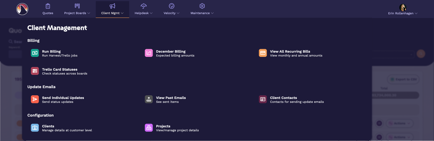
Take a look at this example of a mega menu from a revamp we did on our internal software.
Out: Accessibility as Extra Credit
In: Accessibility First
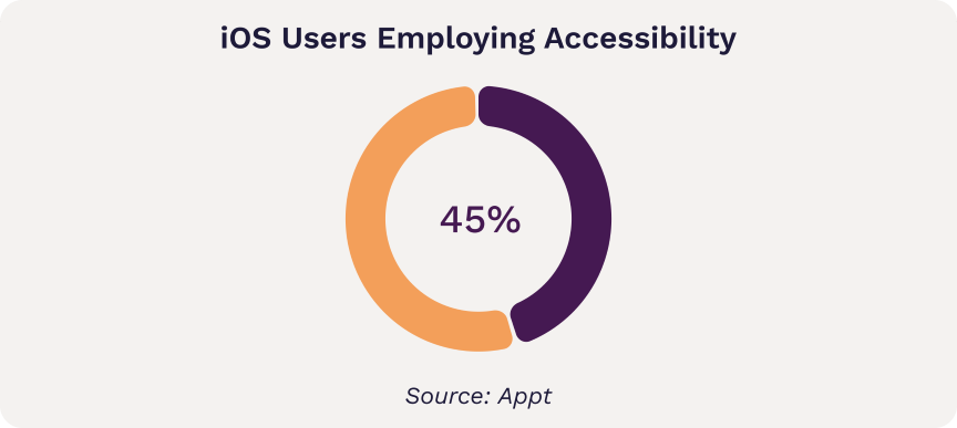
One of the best things to come out of Apple’s now-accepted iOS 26 glassmorphism line in the sand was a real discussion about accessibility. It’s about time—nearly half of all iOS users employ at least one accessibility setting. Our position over the last few years has been that we ought to respect signals we have about user preferences from their device vs. creating a bunch of new controls within the app for the user to deal with. This appears to be one we got right as well based on where the industry is headed (I promise I’ll also be transparent about the calls we miss on, this year just happened to go our way).
Accessibility is expanding to encompass more variation and preferences, including low-motion options which can help neurodivergent users. A user can’t appreciate a fantastic flow if an aggressive animation makes them dizzy. How do you do that? It’s as simple as respecting a flag and turning off animation for users whose device settings indicate they prefer low motion. Much like the idea of progressive enhancement, rather than have an entirely separate design for users with specific preferences, tech designers can simply turn off parts that are problematic. This requires a bit of thought up front but after that is pretty seamless to integrate.
Since most of our subscribers are leaders, you may be wondering what this means at a strategic level. The idea is to treat your interface not as an immovable object but an adaptive framework — not unlike the conceptual shift from pixel-based web design to responsive.
Here are 3 questions you can ask your designers to begin the discussion:
1. How are we adapting to user device and browser settings like dark mode and prefers low motion?
2. Why did we choose that approach?
3. How would we do it if we were starting from scratch today?
Out: 17 Places to Log In
In: Single Pane of Glass
One consequence of the proliferation of SaaS products has been fragmentation of workflows. It’s not uncommon for training for new employees to involve instructions like “When you begin, check out the task from Squirtle and then log your time in Pikachu. Then post in Quaxly for review, and once it passes, upload the final version to Charmander. Oh, and don’t forget to update the status in Weedle!” (Pokemon names used in place of real SaaS product names to protect the innocent, and because it makes me smile.)
All of these products are uniquely valuable, and yet together, it creates a training challenge and increases mental load. What are companies doing to cope? Three main strategies:
Use APIs to interact with utility products instead of requiring employees to log in directly.
Eliminating separate products used for one thing only, and replacing with a plugin or custom solution that integrates with the main tool.
Centralizing data through automation—one task that increases the need to log into multiple systems is reporting. If you can automate the centralization of that data, you eliminate part of the pain.
Even eliminating one or two additional places to login can make a big difference in mental load and efficiency.
Streamlining and Executing
If 2025 taught us anything, it's that more isn't better—better is better. Smarter chatbot placement, data-backed AI investments, intentional color, curated options, adaptive interfaces, consolidated workflows. The companies that thrive in 2026 will be the ones who resist the urge to do everything and instead do the right things well. Oh, and if you need help examining any of these shifts, we do that. Drop us a line. Now if you'll excuse me, I have a corgi sweatshirt to put on and a new year to plan.