
iOS 26 is coming whether you like it or not
Apple releases a new operating system every fall. However, it’s been several years since one garnered as much pre-season speculation and hand-wringing as iOS 26.
I wanted to take a moment to share some personal thoughts on how iOS 26 is affecting the landscape of tech products. This article is for the decision-makers who don’t need to know which boxes to check, but do need to know how to think about these changes long-term.
My company, People-Friendly Tech, has also published a detailed tactical guide for iOS 26 implementers, which you can get for free either by being one of our clients (in which case it should have already been in your inbox, message me if you didn’t receive it) or by accessing on our website. It’s free if you sign up with your name and email, and you’re not subscribing to anything unless you choose to check that box. But our monthly-ish newsletters are informative and not salesy so I encourage you to sign up.
Back to the subject at hand: the seas never stay calm for too long in tech, and right now they’re roiling.
Is Liquid Glass ugly or beautiful? Does it matter?
A lot of the early attention and consternation has been focused on the appearance of the new OS. I think this is missing the point, but since it’s gotten so much attention I’ll address it.
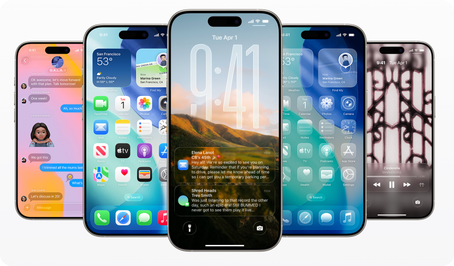
iOS 26 preview images from Apple’s iOS 26 preview are provided for educational purposes only. People-Friendly Tech is not affiliated with or endorsed by Apple.
Liquid Glass: the aesthetic changes in iOS 26
People have been installing more apps, and apps have been going to bolder and brighter colors for their icons in response to design trends. This can lead to an overwhelming Skittles-effect screen, which is unpleasant and (likely in Apple’s view) an affront to their sleek aesthetic.
For every action, there is an equal and opposite reaction. iOS 26’s screenshots feature some glass-effect, tone-on-tone icons on the home screen that have raised some eyebrows—essentially running app icons into what they might look like if etched into frosted glass hovering above your background.
Many commentators immediately started sharing high-pitched hot takes about how awful this was. The glass effect also extends to certain native features like the search bar, which features a glassy effect that seamlessly transitions when pulled up.
The effect is a lot calmer than a traditional app home screen with icons featuring their own color schemes. Apple has found a way to tone down the discordant notes and make everything feel more harmonious.
Is this good for people’s ability to find the app they want, or bad? Regardless, it’s here.
We see this as a fairly predictable reaction to:
The aforementioned Skittles effect
The proliferation of apps and the recognition that people are beginning to use the search bar or recent apps to find the app they want rather than relying on the icon
Brands’ spotty experimentation with neubrutalism (the design aesthetic using bright, unfiltered colors and high-contrast elements as if it were a cartoon illustration)
How to think about Liquid Glass’ aesthetics as a leader
There’s more reason to pay attention to Apple's aesthetic choices than, say, SAP’s. Apple is considered a tastemaker, and they have a lot of brand power. It’s likely (though not a sure thing) that their distinct choice to swing back toward lower contrast, softer interfaces (and reduced color palette) will have some influence on the tech space at large.
This does not, however, mean you need to run out and immediately change your brand. (Okay, if you went hard for neon colors and neubrutalism it might be time to temper that a little, but that was bound to happen.)
Your brand didn’t look exactly like Apple before iOS 26, and it doesn’t need to look exactly like Apple after. You have your own unique style and taste. What is helpful, however, is to consider that these sorts of corrections happen for a reason, and thoughtfully responding to the direction of the prevailing winds keeps you in-tune with your user base.
The big takeaway: We recommend working to soften brand changes gradually and intentionally, not in a fell swoop. Try out replacing some of your most jarring design choices with something softer. You’ll get a lot of perceived benefit without a full-scale redesign. And if you need help with this, we can assist with a UX Focus Sprint or UX Audit.
Accessibility in iOS 26: Power to the people
One of the major objections to Liquid Glass is around accessibility. Assuming the original icons by the app developers followed appropriate WCAG contrast ratios, it’s likely possible to preserve reasonable contrast ratios in a monochromatic look.
The very lightest parts appear white, though the darkest don’t appear black, hence the ‘reasonable’ modifier. You won’t achieve ultra-high-contrast, but you will be able to achieve a surprising amount. We cover this in more depth in the aforementioned company piece. But there’s another reason we think this concern is a little overblown: user choice.
Full details have not yet been released, but from what we do know, iOS 26 respects light and dark mode and the normal accessibility controls (high contrast, large text, etc). The user also controls the background on their home screen. If a user wants the ability to have higher contrast, a darker background immediately provides that.
Backgrounds also appear to be customizable in Messages. It remains to be seen exactly what options are available, but one would assume there will be considerations for those who prefer higher-contrast options.
The big takeaway: Individual app developers who use native development or React Native (because it relies on native components) can choose how and when to implement Liquid Glass. The initial recommendations are to use sparingly. You may also want to re-examine your accessibility strategy to give the user more choice, and we cover the implementation particulars of this more in our guide.
Choice enters the chat
One of the points most of the pieces I read are missing is that Apple seems to be offering more choice than ever before. One of the big gripes about Apple from day one has been that it provides a beautiful interface at the expense of user (and developer) choice. It’s like going to that famous hairstylist who charges $500 and you aren’t allowed to have input. You’re going to walk out with a great haircut, but it might not be what you wanted.
Apple seems to have finally heard this feedback and done something about it. I’d argue this was a necessary step for them to be able to bring their Liquid Glass dreams to fruition in an ADA-compliant world. By creating a distinct aesthetic but letting the user customize it, they’re doing something very technically ambitious but also nuanced.
They’re also making a strong case for those controls being at the OS level, and that apps should respect those settings vs. creating their own in-app settings. We’ve steered clients this direction for years so I don’t mind crowing about this a little bit.
This isn’t just about aesthetics. Finally, after more than a decade, Apple has heard the collective pleas of the masses to be able to customize the snooze length on the alarm (a feature that in my opinion should have been included in 2011, but I digress).
The big takeaway: You can make bold aesthetic (and functional) choices if—and only if—you are willing to also do the legwork to allow people to customize when it doesn’t work for them. Plan on a 1.5–2x budget and runway, and prepare to lead the pack.
Apple is pushing UX – and pushing out hobby and low-effort apps
Apple has never had a problem being a gatekeeper. Their app review and approval process is famously much more stringent than Android’s. That’s not going away, in fact if anything, it’s getting more pronounced. Apple’s aesthetic guidelines for Live Activities alone runs 4400 words and includes requirements on maintaining concentric rounding of elements within the status bar and expanded versions, as well as light and dark mode.
These are the kinds of things that professional UX designers consider by default, but for hobbyists or part-timers, and even small businesses without a UX professional on speed dial, it’s a high bar to meet—especially considering that this is just one element of the new OS.
Another way in which Apple is making it harder for those with fewer resources is that iOS 26 appears to be starting to push out certain hybrid apps. React Native, due to its reliance on native components and AoT javascript compilation, continues to be just fine (1), but Ionic and Flutter are left without a reasonable solution to emulate native look and feel.
They’re also pushing standards toward a place where every app developer will need a professional UX firm on their side to have a credible app.
Ionic—and to a lesser degree Flutter—also have some serious challenges for javascript compilation (2). This may not be an accident. Apple has made no secret of their desire to keep the quality bar for app experiences high, and weeding out the stuttering and performance issues of non-native-component hybrid apps is one way to do that.
In the tech game, sometimes you pick a winner and you’re naive if you don’t recognize that sometimes you won’t. We happen to be on the winning side this time with our past recommendations for React Native, but we’re aware that may not always be the case.
That said, we still feel well-positioned continuing to recommend React Native as our primary mobile dev platform. It has always been in a separate category due to the use of native components—unlike all other hybrid platforms—and continues to hold up through this major shift. With the ability to add SwiftUI for specific native components if needed, it continues to be a solid bet.
There were a few click-bait early articles claiming iOS 26 was problematic for React Native. That’s true for some unmaintained React Native apps, but it’s probably equally true for any unmaintained app.
If you are extremely risk-averse and want even more insurance, we recommend outlining a backup plan to transition specific components to SwiftUI as needed, which can be done relatively quickly (if you’re our client, this is already planned for).
The big takeaway:
Evaluate your commitment to your app. Is it a core part of your business, or a halfhearted effort? If you’re not prepared to invest, this may be the time to get out. If you are committed, now is the time to get serious about your strategy.
Evaluate your platform. If it’s Ionic, consider migrating to ReactNative or fully native, understanding that fully native is the highest cost. If it’s React Native, you can stay where you are as the platform already uses native components. If you’re currently on Flutter, caution is advised. The issues are patched, but the platform’s going to have a hard time keeping up with the Liquid Glass UI. It’s not where I’d invest additional dollars at this time. If you’re fully native, stay where you are, or consider React Native to reduce development costs if you’re looking to make a major shift anyway.
Evaluate your development team (internal or external). Are they poised to take advantage of new native features? Do you have sufficient resources or need to consider a flexible outside option to expand your resources as needs arise? If you need help, we do that.
Evaluate your UX strategy. We’re admittedly biased, but we suggest forming a relationship with a professional UX consultant who can help you navigate. It can be us or any other qualified firm, but don’t try to ignore it or shuffle through hoping Apple won’t notice. Firms like ours see these problems across a wide variety of clients and bring that experience to bear for you, so you don’t have to experiment on your own dime.
Evaluate your pace of change: Regular improvements are becoming the norm - waterfall is out to stay. You don’t have to take advantage of all or even most new features on day zero, but you do need a thoughtful roadmap to show continued enhancement over time and maintain your app at least quarterly.
The rubber meets the road for tech revolutionaries
This is where it gets interesting. Those who are serious about innovating with apps are being pushed to be more innovative, and those who are less serious are likely being pushed aside. I’ve focused on the most sweeping changes that affect leadership decisions, but there are a host of other feature changes that are more tactical in nature. These are covered in more detail in our guide.
Live Activities are getting even more prominence - great news for those who can take advantage and want their app to feel responsive without bombarding users with notifications.
AI image upgrade - Apple’s AI image features are getting some nice new perks.
AI for productivity - Apple is paying more attention to the phone as a productivity tool vs. strictly personal use, with some features to make it more productive with AI.
More hierarchy - when there’s a lot of information, you’ve got to give people a way to filter. Like a news site, they’re using hierarchy patterns to make the interface easier to scan.
A moment of recalibration
Love the iOS 26 changes or hate them (and there’s a scientific reason you probably hate them, at least at first), they are coming. We’re still far enough ahead that this can be a moment to read the signs of change and embrace what makes sense for your business.
Onward & upward.
Notes
Provided your RN version is on the latest and you aren’t using deprecated forms of webviews. Of course, as always, you should test on the new OS including real device testing to identify any anomalies.
Flutter originally had an issue too, but it was patched. Some of Ionic’s more technical issues are probably solvable with time and I assume the Ionic platform will make an effort to scramble to do so ASAP, but the inability to replicate the Liquid Glass look without native components is likely insurmountable long-term.